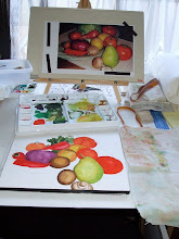
Artists Statement

I paint as often and as much as I can. I take classes when I can afford it, but the money usually goes to buy more art supplies. This blog is to share the results with you! I am a Work in Progress.

Dianne Lanning Fine Art.com


Friday, February 24, 2012

A plethora of sketches

The Goose Family
Let me introduce some local friends. This was at Lake Elizabeth last year, I'd forgotten it, as I was digging around for fresh sketchbook to carry around with me I found this in a partly used one.


This a a dry river/stream bed near here. There are a lot of these right now, we are way behind on our rain. Fortunately, the rain that has missed us has floated on over and fallen as snow in the Sierra, so it will go into the watershed.


From a Lee Brown photo, w/permission
If you haven't checked out A Day Not Wasted, by all means do. The photos are wonderful, especially for painters. This is a photographer with a painter's eye! I received permission to give three recent pictures a try. My proportions are all out of whack on this sketch, but it's the first one (excuses, excuses) but I hope to do a watercolor of this. The foreground boat is a lovely turqoise against deep green pines of the Northwest forests. I'm still finding my way around this picture. The other two are seascapes, one of which I have begun in acrylic.


Les chats des Paris
This one is thanks to "Paris Through My Lens" a wonderful blog. This photographer lives in the American south but loves Paris and visits it often and takes the most atmospheric photos I've seen of it. This one is in Les Jardins du Luxembourg. Thank you Virginia for allowing me to work on this one! A tree in the foreground has been removed, artistic license. This was a test, it shows me that it will be necessary to mask the trees and wash the background in dark, then make the kitty a lot brighter tortoise shell so he/she becomes the focal point of the painting.

Two for one
Two separate sketches scanned together, lazy me. It is just sooo much more fun to draw an experienced face! Could you ever get a comparable expression on anyone under 40? No! It takes years of experience to really polish the art of expressing oneself. I got the idea from Carol Marine, on her blog she did a series of wacky faces.
The hand is a bonus, an empty page, and I have the model with me wherever I go.

Tuesday, February 21, 2012

Paper Work

I spent today, well, too much of it, doing the paperwork part of business. It was necessary, and the results are encouraging. However, for art I spent a long time on another sort of paperwork. The results of that have to wait, it's from some one else's photo, I've asked the photographer's permission to post it.
So for today I thought something old (last year) that I haven't posted before, and it's on PAPER!
Veggie Puzzle
This is a 12X16 watercolor of a jigsaw puzzle I used to have around here. I'm not sure if it's still around, but I loved the picture. After it was assembled. I cropped the other half of the gate, I wanted the focus on the veggies. Hmm, the low wall on the left looks odd in the photo. Not sure what happened with that. Funny how they can look different when you take a picture or scan of them. What took the longest? The gate? No. The squash? No. The radish leaves. They have been, well, you know the old saying, "try, try, again?" Well, my mom used to add,"then stop, don't make a fool of yourself." It's time to move on.

Monday, February 20, 2012

Presidents Day!

South Pasadena
Well, I guess I haven't done any presidential sketching or painting. Here I was thinking it could be interesting to find pictures of the great composers and conductors from the early twentieth century, like Toscanini, Rachmaninoff, ones who have actual photo's, and sketch from the photos. Old photos can often have strong contrast and these people usually have interesting faces. I completely forgot about presidents. Or was I avoiding? teddy was interesting, as were most of the Roosevelt's. Most were not interesting to look at. They lack the fire you get in composers and conductors. I should have some evidence of this claim inserted right here, but I haven't done the actual research yet!

On PBS last night was a Doc about Prince Phillip at 90. I was surprised at how interesting it was. No offense meant. I knew Churchill was quite a painter, I had no idea Phillip had an artistic side. They didn't show much, they probably never will, but what I saw was good. Churchill's style was like him, flamboyant, colorful, and Phillip's is his own, realistic, detailed, and good too.

Now that I think about it, I paint rather more like Phillip. Not what I wanted to realize. I love color, and there were times in my life when I was wild with it! Now I will do a painting twice sometimes, accurate first, to get familiar with the subject, and then I go back and let loose. Well, I let some what loose. It's coming. And now for something completely colorless. I pulled out the sketch book I've been carrying around for a bit and finally scanned some of the pictures:
 I've been trying out two new pens and they don't have waterproof ink, hence no color.
This is, of course, the Golden Gate Bridge. The Bay Bridge is in such a state right now, I haven't wanted to sketch it.

Then below is one I did on a Friday afternoon on my way back from RFB&D. It's Coyote Hills Regional Park. There are acres of marsh, cattails, marsh grasses, reminiscent of way back when Concord had marshes.

 A lot of the time, whenever I get the chance, I sketch at Lake Elizabeth in Fremont. This is one of the sights, some how the birds standing around looking bored near the "Lake Closed" sign seemed very worth a picture.
 Another day at Lake Elizabeth but with a storm coming in fast. I had to go sit in the car to get this one, it was already sprinkling where I was sitting.


 Ah, lunch out! I splurged at Texas Roadhouse. A "rugged" looking place. It's a little loud there, no soft surfaces to absorb sound. The peanuts are good and so are the steaks.
At Lake Elizabeth again. There was a variety of water fowl there, and some I couldn't identify. So I drew them all and checked on line. The main mystery bird was the American Coot. (@#*$) Sorry, I start chuckling every time. I guess I didn't know there really was a "coot" aside from the "old Coot" I'd heard all my life.
There was also that great crooked tree!

Friday, February 17, 2012

Blue cloth

This was a challenge from Rookie Painter. And it WAS a challenge. Reflections are challenging, and so this was.
Watercolor, 5X8

The kettle got out of hand in trying to fix things. I may try to pick up some paint and see if I can make it a bit better. There was a certain lack of preparation involved. Or not involved? Anyway, if you are looking for something challenging, check out the link!
Hmm, I need to try this again. And again, and again. Reflections, grrr.

Thursday, February 16, 2012

Ink wash experiments

Ink wash, 6X8
For Christmas I received a bottle of Private Reserve Ink in Midnight Blues. It's for fountain pens and is great for washes. I just found that out. It's very dark for writing, but add a little water and it lightens into a rich blue. Using a brush pen filled with water I started experimenting yesterday. So many plein air sketchers talk about using ink washes, I had to figure out how to do it.

I recently found a set of Winsor & Newton inks on the bargain shelf at Michaels (someone had stolen the black) at a greatly reduced price. It's a set of eight, well seven, but I already have black. Now I look forward to trying this with them. I still want to continue drawing in them, now I want to try adding a little water with the brush pen to see what happens.


This was a quick experiment with Mont Blonc's Toffee ink. It writes and draws as a rich dark brown, but with the brush pen it attenuates to a redder color. It was wonderful to see what happens as you play with it and smoosh it around to see what it does.

I went back to one of my current sketch books in which I had drawings with this same ink and just touched in a little water. Wow. Ok some did NOT look better for it, but it was "wicked brilliant" what it did to some. It seems to work best to soften shadows, but leave the outlines as much as possible.
Those pictures are not posted because it was light weight sketch paper and is now ruffly from the water. I wish I knew of a hard bound sketch book with heavier paper that could stand a bit of water. Not quite 140lb paper, but something heavier than in the "Reflections" books I have. They are good for sketching and drawing, as long as you don't get too much ink on the page or it will soak through. Yes, it's that light. Pentel and Tombow seem to do alright, and the Rapidograph. But I have to be careful with fountain pens, anything that can let a lot of ink flow.

Can anyone suggest one? I prefer hard bound, but that may have to change.

Tuesday, February 14, 2012

It's Valentine's Day!

Happy Valentine's Day to all!
Valentine Heart w/ Mint (W/C 6X8)
Have a happy day, and know that you are loved!

If at 1st you don't succeed...

try, try, again. Sigh.

Aspen glade, 6X8 watercolor
The first time I tried this one, the aspens turned into some other deciduous tree with dark bark. This time I remembered to use some masque. This time it's not snowing, too much was going on for to me to keep track. Still life has been my main thing for a long time and a friend advised me to try landscape and portraiture too, it would help all phases of my work. It's true. Have something you do mainly, that's fine, but keep trying other things, what you learn will make all you do better.  Just don't get discouraged during the learning curve. Sometimes I do.

Sunday, February 12, 2012

More Pen and Ink...

Tools of the trade sometimes inspire! Last Fall I got a 9X12 wire bound multi-media paper pad. Fountain pen ink and watercolors both tend to soak right through regular sketch paper.  This recent one is from an internet artist challenge, but which one? Oops. This one is in Mont Blanc's "Toffee" ink, a favorite.
Pitcher and Pinecones, 9X12
I Love the color of this ink, especially on cream paper. The paper in this pad is very bright white, but is nice and sturdy so the fountain pen doesn't scratch groves in it, nor does it soak through to the other side.

Next is one I did last November at the duck pond in the Hayward Japanese gardens. I had to do it from a photo, because ducks, well they fidget. It's annoying and wonderful.

Japanese Gardens, 9X12
This was a lesson in not drawing at high noon. I liked this colorful little guy, and he was relatively easy to draw. The huge boulders at the back were more difficult. I remember mother saying rocks were one of the most difficult things to convey. She's right. But I'm not sure she ever tried snow though.

Thursday, February 9, 2012

Apres le pluie

I was just visiting another blog, "Paris Through My Lens," and now I'm thinking in a French accent. Does that happen to you? On this blog are wonderful photos of the City of Lights, and she has the most lovely French songs playing. A la prochain:(Boy, my Spellcheck does not like French!)

OK, back to northern California, We had some rain finally and now the Sierra's have snow! So I dug up some images and played with things in my head and came up with this:
Aspen, watercolor, 6X8
I was thinking of one year I was in Boston at the end of October. The maples have so much color. I only experienced that once. When I was a kid we used to go up into the Lincoln Nation Forest when the aspens turned, that can be pretty impressive too. There were roadside stands with apple and cherry cider for sale. Oh, I digress!

For the falling snow I used Winsor & Newton white Calligraphy Ink. The ink was splattered the usual way, but still didn't quite show up enough so I went back in with a dip pen and put a dot of ink on the semi-transparent dots that were there from the splattering. I was trying to keep it looking random. The colorful tree looks like it should have been more gold, but I was using a maple and they are so definitely RED. It was in a field, but the other trees kept multiplying. I was fixing things and it got out of hand.

For some reason I usually put my light source on the left. I haven't figured out why I do that. I tend to be right handed, but I'm ambidextrous. When I learn something with one hand or the other, it tends to be the one I use for that. Of course they usually teach you to do things with the right hand first.
When I start to sketch something vertical and am not paying close attention, if I step back and take a look, everything is leaning to the right. That's a correction you'll see on lots of my stuff.
I'm also trying to learn to use more purple colors. It's an adjustment I have to make in my perception. It's a beautiful color, but I don't wear it well at all, and after all the avoidance it has to be re-incorporated into my spectrum or palette when I paint.

The Paine Massif picture continues. I'm not sure it "progresses." I like the way the main peak is now, but the rocks and snow at the base are discouraging. I thought I did some good work on it yesterday, but when I went back last night, it wasn't all that good. The shape is too complicated and starts to predominate when the peak is the main figure. I'll see if I can get a good shot of it today and upload it. I have to tone down the foreground. Or something.

Friday, February 3, 2012

Ah, February

It seems that Punxsutawney Phil saw his shadow and we'll have 6 more weeks of winter. But I've got plein air dates set! Oh, Phil, how could you?
So, this means more studio painting. "I'm not bovvered." I need to keep working on the Paine Massif. In the meantime, while puttering at the dinning table last night (when I have a perfectly good studio) I found myself doing the Rookie Painter challenge.
Watercolor, 6X8 Rookie Painter
I had dropped my Van Hogh (yes, that's the way it's spelled on the case) pocket size watercolor plein air set with the small block on the table for some reason. A larger brush than size two would have been my choice, though, for the background my finger helped spread the wash. Watercolor takes frequent practice to keep your hand in, and I have been neglecting it. There is still something so immediate about it though. I often visit the blog page of David Lobenberg, a very experienced artist who is currently doing a lot of watercolor. There is a link in my list of blogs. There you will really see some watercolor. Check out some of the others too, like Contemporary Realism and any with the word "watercolor" or "Aquarelle" in the title and you can see some exciting art.