

While trying to get up to speed on supporting yourself with things you love to do, it seems sometimes you have to do other things too. Like housework and looking for other kinds of work that have an actual income. Never lose sight of the value of what you do. That's the first step toward others valuing it also. What we do is not just an expression of who we are, but where we come from, who created us. We reflect all those good qualities, and express them in our lives. That's our main job. Our employment.
Sometimes that takes practice, and continuing to learn and expand our expression is absolutely necessary. That's living.
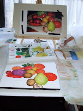
Lately I've been wrestling with these ideas and trying to open my thought to the new, while keeping in practice on the familiar. Aside from looking for a paying job before the money runs out, trying new things continues. I've taken three beginning/intermediate watercolor classes with Ron Pratt and he taught us how wonderfully intense color can be in the medium. It was great! I also enjoy the Artist Challenges that are available in blogs like Rookie Painter , and Paint and Draw Together. Having a challenge set by someone entirely different from yourself makes you stretch yourself in directions you might not have taken. Not just in subject matter, but palette and style. Some results are not all you hoped they could be: see the lemons above. But you learn a LOT. It can lead you in new directions, it's worth trying it again. In this case these colors provided a challenge, especially their lighter values. This resulted in the Japanese scroll vignette (I think it's up in the right corner, I can't seem to get the pictures to go where I want them within the blog).
I didn't try to duplicate the script on the scroll, that felt too much like plagiarism, so I did an "impression" of it. In a scroll like this the calligrapher's hand is as much a part of the poetry as the words, and it wasn't my poem. The picture is 8X12 inches.
The daises are a rather European touch, a peony would have been more appropriate, but this is the way it turned out! The purpose was the paler palette, perhaps I will do it again with a more strongly colored flower later. The contrast could be very interesting.
Well, it's going to be a short day today, I have to get up about 4:30AM to get to Sacramento by 8AM for a placement test, the next step in trying to find some income.


I really like your lemons. The bright yellow you achieved - I couldn't get it that bright (and I wanted to!). Good work!
ReplyDelete