Artists Statement

I paint as often and as much as I can. I take classes when I can afford it, but the money usually goes to buy more art supplies. This blog is to share the results with you! I am a Work in Progress.

Dianne Lanning Fine Art.com


Showing posts with label blue. Show all posts

Thursday, February 16, 2012

Ink wash experiments

Ink wash, 6X8
For Christmas I received a bottle of Private Reserve Ink in Midnight Blues. It's for fountain pens and is great for washes. I just found that out. It's very dark for writing, but add a little water and it lightens into a rich blue. Using a brush pen filled with water I started experimenting yesterday. So many plein air sketchers talk about using ink washes, I had to figure out how to do it.

I recently found a set of Winsor & Newton inks on the bargain shelf at Michaels (someone had stolen the black) at a greatly reduced price. It's a set of eight, well seven, but I already have black. Now I look forward to trying this with them. I still want to continue drawing in them, now I want to try adding a little water with the brush pen to see what happens.


This was a quick experiment with Mont Blonc's Toffee ink. It writes and draws as a rich dark brown, but with the brush pen it attenuates to a redder color. It was wonderful to see what happens as you play with it and smoosh it around to see what it does.

I went back to one of my current sketch books in which I had drawings with this same ink and just touched in a little water. Wow. Ok some did NOT look better for it, but it was "wicked brilliant" what it did to some. It seems to work best to soften shadows, but leave the outlines as much as possible.
Those pictures are not posted because it was light weight sketch paper and is now ruffly from the water. I wish I knew of a hard bound sketch book with heavier paper that could stand a bit of water. Not quite 140lb paper, but something heavier than in the "Reflections" books I have. They are good for sketching and drawing, as long as you don't get too much ink on the page or it will soak through. Yes, it's that light. Pentel and Tombow seem to do alright, and the Rapidograph. But I have to be careful with fountain pens, anything that can let a lot of ink flow.

Can anyone suggest one? I prefer hard bound, but that may have to change.

Tuesday, July 5, 2011

Independence Day!

This is a Work-in-Progress, there wasn't even a set up for it. Or as one art instructor I know says "OH," or out of my head. Hmmm, that can fit more than one way.
American Color


 This is an 8X8 watercolor in honour of the Fourth. In all honesty, the flag drape probably looks improbable because it's pure imagination, as is the rest. The colors need to be more intense and the shapes firmed up. Looking at it this morning, with at least a little "distance" from it, I can see the lesson again that it is better to simplify, ie. do a few things well rather than a lot of things poorly. Ah, yes, it's brimming with mediocrity!
No, No, my fans and friends, don't say it

*crickets, crickets*

Oh, you didn't say it, so . . .  Anyway, that's why I'm considering it a WIP. Excuses: I was at the dining room table and grabbed some not-so-good watercolors that were nearby and started painting in and amongst the hot dogs. Remedies:

1. Keep better quality watercolors to hand.

2. Do more preliminary sketches.

3. Actually drape some fabric, if not the flag, then something with stripes.

4. GO TO THE STUDIO, THAT'S WHY YOU HAVE IT instead of more living space.

5. Be Prepared (Girl Scout Motto) Ah yes, this lesson, over and over and over and over and over, it must be learned.


Horses or My Little Pony

Now this one. This was a picture of some mustangs I found on the web. When I was a young girl I drew horses incessantly. This surprises few people. Even at that age, though, they came out looking more like mustangs than (sigh) My Little Pony. (This is sooo embarassing) No excuses, I need practice. I'll have to find out who the photographer is, I wouldn't want them freaking out. Somehow I've got to figure out a way to make the lower jaw of the sorrel lighter, right now it disappears into her back.


Seaside visit
This is about 5X7 and is here along the Pacific Coast. The rocks came out pretty good, I was surprised, I've been practicing (self-satisfied smile). Now it is all too evident that it's time to work on surf too. This needs planning. To do surf right, it takes masquing, and to do that right takes sketching, which means pre-par-a-tion. Oh yeah, that.

I still like the rocks.


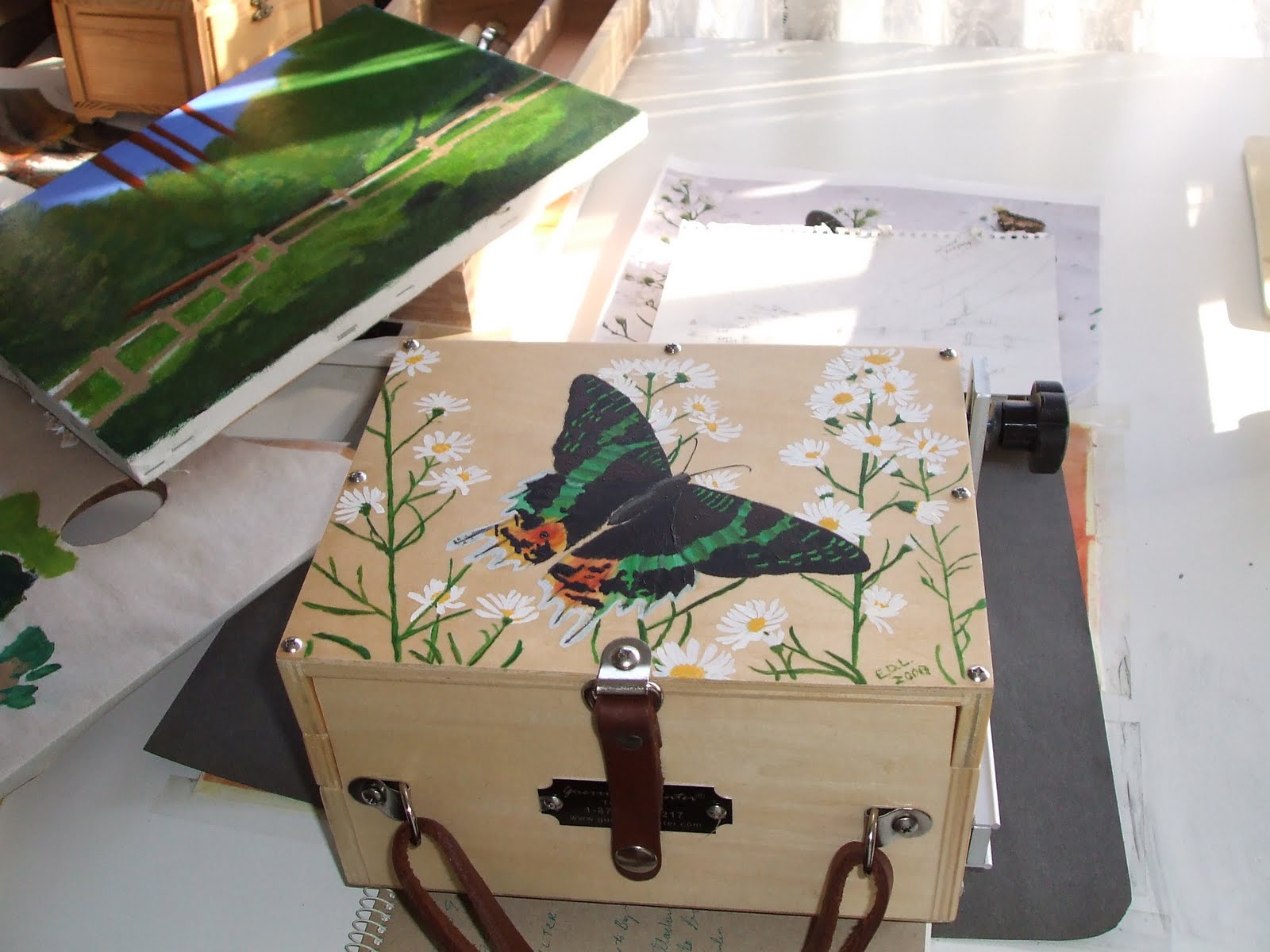
My Pochade Box
Summer is here like gangbusters. Time for more plein air painting! This is my barely broken in Pochade box from Guerilla Painter.  There was no picture on the top, but it just cried out for one so, hence the butterfly. Then varnishe to protect the picture. This pochade is pretty neat, this is the "thumbox" model, and yes, there is a hole you can open in the bottom so you can put your thumb up through it to hold the box steady while you paint with the other hand. Something I have not mastered yet. I need more hands. And more forearm strength. Fortunately, these clever people also put a bracket on the bottom so you can screw it on to any camera tripod and you can have your hand back! Yahoo! Santa, I need a better tripod. The one I have works, but it can't be tilted at the top. No, I'm not spoilt, you've got almost 6 months.

Ah! the sun is out, the birds are singing, the Liquitex is packed in the pochade box, it's time to paint. The dishes (vacuuming, dusting, mopping, laundry, mowing, sweeping, pruning etc) will get done later. Ur, Uh, sometime.

How about a run to the Coast! It's an opportunity to practice painting surf. What good girl I am!

Monday, May 30, 2011

Memorial Day Celebration

AMERICAN STILL LIFE
This is a day set aside to remember. Raised in a very patriotic family, and living in other lands, when I hear complaints about here, I can give it a quick thought and realize, nope, here is BETTER. I know first hand. Why do you think people are still streaming in?
The above tiny watercolor (4"X10") contains the Colors and a few objects hoping to symbolize how we all come from somewhere, and we all came here to participate in BETTER.
Now I need to finish the painting above, the scanner showed me some problems!

Saturday, April 16, 2011

The plein air season has begun!

Last Saturday was my first genuine Plein Air Paintout. Courtesy of the East Bay Regional Parks, we were at Coyote Hills. What a lovely group, so many excellent painters. Mine looked like it was done by a school kid. It helped me learn a lot. Above is the view from where I was painting.

Here is about 9AM (We started at 8AM, well most of us) The light was changing gradually, but the water changed constantly, and always looked better than before. Have to pick a version a go with it!


In avoiding a decision, more reeds went in as well as the tower from Cal State Hayward way, way in the back. Starting to put in some shadows now in the water. Need to mix a deeper green, nothing comes out dark enough. It's all coming out medium to light values. BLAH!      


Getting toward noon, time for judging. Working on the water and reflections. Time to buy some really dark green oil paint. There is some veridian at home, but I seldom use it, may be with some white mixed in it will work for the sage on the left! Still mostly medium values, somewhat accurate, but not interesting. The park ranger kept coming by, he loved it. We can always use supportive fans!
  

This may look odd, but the top one is the plein air, with a little more work on it this week, including bug and leaf removal, it got windy. After looking at all the great stuff the real pro's did I was inspired to give some techniques a shot. The bottom one was done about half with the palette knife. It was the only way I could think of to loosen up, get more vivid, and not get so buried in the detail. I wanted to put a big tree on the right in the foreground, but I didn't have the nerve. I did put in the Canadian goose that was hanging around. There was also a bumble bee that visited me a few times that morning! I hadn't seen one since I lived in England! what a treat!

This is for a friend. She wants something pink for the bedroom, and watercolor takes constant practice, so I thought I'd try this for her. Sort of a semi-permanent lend. It needs a little more deep pink in the center and something more interesting done with the negative space in the upper left. Watercolor is very calming...when it isn't totally exasperating!


Current acrylic on the ole easel, a still life I set up in the studio. The blue bottle turned into a blue jar. The golden yellow table cloth under the white scarf had to go. Thanks to this photo, I noticed a perspective problem with the green jug. That fruit could use a little tuck here and there too. On the whole though, I think I will like it. The strange brown blotch by the grapes is a grape leaf, OK?

Today was a plein air session at Stowe Lake in Golden Gate Park with the California Art Club. Sorry I missed it, I just didn't have the gas to get there. Next time!